Essential Design Tips for Creating Award-Winning Mobile Apps
Do you want a great mobile app?
Based on your app development strategy, the app might perform well, but that’s only half of the battle. If you really want your app to shine, it needs a killer design.
Whether you’re designing the app yourself or hiring a designer, I’ll give you some advice to make your app look like it’s an award winner.
Key Takeaways
- Design Consistency: Stick with familiar design elements to ensure user comfort and ease of use.
- Grid Utilization: Use grids to maintain a neat and organized layout.
- Color Strategy: Choose colors wisely to avoid user confusion and enhance usability.
- Screen Adaptability: Design for various screen sizes and resolutions to reach a broader audience.
- Loading Speed: Simplify design to improve app loading times and user retention.
This guide is also a great reference for designers who are working on multiple apps for various clients.
Apps that aren’t designed well simply won’t succeed. You might be able to skate by for a while, but ultimately users will get frustrated and stop using it.
Follow the advice that I’ve outlined below to make sure that this doesn’t happen to you.
Here are the top 21 design tips that everyone absolutely needs to know. Let’s dive right in.
#1: Stick with what works
There’s no reason for you to try and reinvent the wheel when it comes to designing an app.
Don’t get me wrong. I’m not saying that you can’t be creative. However, you have to stick with what has worked historically and what users are familiar with as well.
The majority of successful apps all have similar designs. Don’t design an app that’s going to have a difficult learning curve for users.
Take a look at some of the top mobile apps and see how their design is laid out.
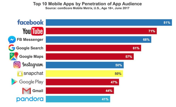
Use these as a reference to come up with common design elements. Lots of these will have similar features.
For example, most mobile users are familiar with common touch gestures.
| Gesture | Expected Action |
|---|---|
| Click on a button | Navigate to another page |
| Spread two fingers apart | Zoom in |
| Swipe finger | Move the page |
Furthermore, people associate certain images and icons with what they’ve seen from other apps. One of the most common ones is an envelope icon, which is associated with email.
Don’t start re-assigning different touch gestures and common image icons for other functions.
This will confuse the user and cause problems.
#2: Keep your design on a grid
Use a grid to help you design your app. While it may be invisible, it’s a great guide.
That’s because grids can provide you with an excellent resource to define your spacing.
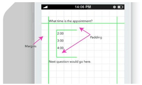
This will keep the layout of your app neat and organized. Grids help you visualize what your app will look like when the design components are complete.
You can make sure that text and pictures don’t overlap with each other. Set and define your margins on the grid as well.
Nobody wants to use an app that has crooked pictures or misaligned text.
#3: Don’t make random color choices
All of the design elements of your app need to have a clear purpose, including the color aspects.
Don’t make the colors too bright, contrasting, or difficult to read. You don’t want to hurt someone’s eyes if the colors are too bright.
Similar to what we previously discussed in terms of sticking with what works, use common color associations for your buttons.
For example, anything that is yes or continues should be green, while buttons for no or exit should be red.
If you reverse common color associations, it’s just going to confuse the user. As a result, your conversion rates will suffer.
#4: Keep it simple
I’m not saying that your design needs to be super basic. Just don’t go over the top in terms of complexity with the user interface.
Remember that real users are going to be viewing and using your app on a small device. Don’t try to jam everything into a small space and expect it to work. UI elements must be taken into consideration for usability.
Here’s something else to consider. If your design is complicated, it could take longer for your app to load. I’ll discuss this concept in greater detail shortly.
Simple designs keep the app users focused. If there are too many bells and whistles to distract them, it’s going to have a negative impact on their experience and your conversion rates.
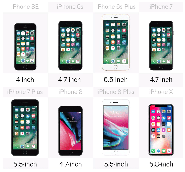
#5: Understand the differences between screen sizes
Mobile app designers need to recognize different screen sizes and screen resolutions.
Smartphones, even from the same brand and manufacturer come in all different shapes, sizes, and resolutions. Just take a look at some of the latest iPhone models as an example of what I’m talking about.
You need to account for other devices as well. Think about how many people will be using your app on their tablet.
Depending on where your app will be available, you’ve also got to take other screens into consideration, such as Smart TVs.
The design needs to be optimized for as many screens as possible.
#6: Repeat elements after they’ve been defined
Let’s say you’re working on the home screen of your mobile app. If the subscribe button is a certain style and color, that same button should be the same style and color on every other page.
This creates reinforcement and gives users an association with that button. It’s all about being consistent with iterations.
If certain button sizes, colors, and designs keep changing from one page to another, it will just confuse the user.
As a result, they may even click on the wrong button and end up on a different page than they originally intended. This can cause frustration and cause people to abandon your app.
It could even give them a negative association with your brand. So don’t confuse your app users and stay consistent be repeating all previously defined design elements.
#7: Clearly separate text
You don’t want different text to run into each other.
In an effort to be efficient in the design of your app, it’s not always reasonable to have huge spaces between every line of text. So you’ll need to come up with other ways to separate the content.
Sure, you can use pictures or page breaks, but you can’t go that route for every single line of text. So you can use some other easy tricks to distinguish one line from another.
For example, the heading of a certain section could be all capital letters. Then right below it, switch back to regular capitalization rules.
You can also underline text to create a separation barrier. Use bold text, contrasting colors, and change the background or font of different lines of text.
This allows you to fit more on each screen without changing the size of your text.
#8: Don’t forget about loading speed
As I briefly stated earlier, if the design of your app idea is too complex, it will affect how long it takes for your app to load.
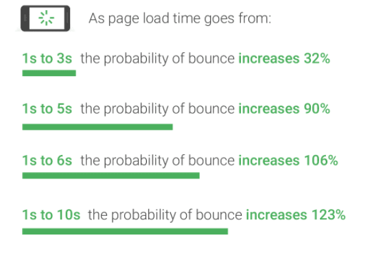
Take a look at how your bounce rate increases with every second that passes when a page is loading.
This will hurt you and cause users to abandon your app. Obviously, this will be a big problem. Don’t make a design that’s so over the top and crazy that it causes abandonment.
Simplifying your design helps eliminate this issue.
Fast page loading speeds will improve the user experience and increase their engagement. When they enjoy their experience using your app, they’ll continue to use it, which gives you a better opportunity to make more money.
#9: Make sure actions are recognized
When a button gets clicked, something needs to happen.
Even if a page is loading, there should be a moving symbol or something to show that it’s being refreshed.
If a user makes an action without it being acknowledged, they may think the app is
Frequently Asked Questions
How can I ensure my app design is user-friendly?
To ensure your app design is user-friendly, stick with familiar design elements and maintain consistency throughout the app. Platforms like Buildfire make this straightforward by providing templates that adhere to best practices.
What role does color play in app design?
Color plays a crucial role in app design by guiding user actions and enhancing usability. Avoid random color choices and use colors that align with user expectations to prevent confusion.
Why is grid utilization important in app design?
Grid utilization is important because it helps maintain a neat and organized layout, ensuring that text and images do not overlap. Buildfire, for instance, offers tools that help designers implement grids effectively.
How can I optimize my app for different screen sizes?
To optimize your app for different screen sizes, design with adaptability in mind. Tools like Buildfire allow businesses to easily adjust their app layouts for various devices, ensuring a seamless user experience.
What impact does loading speed have on app success?
Loading speed significantly impacts app success as slow apps lead to higher bounce rates and user abandonment. Simplifying design elements can help improve loading times.
frozen. This relates back to what we just discussed about page loading speed.
Making sure that their actions are recognized will also help create the illusion that a page is loading faster than it actually is.
A button should have some kind of visual push effect when it’s clicked.
#10: Don’t pick a fancy font
Your font needs to be legible.
Don’t get too fancy.
For the most part, your font should be pretty consistent throughout the app. You could use different fonts for headings or different sections but tread carefully.
Implementing lots of different fonts will confuse the users. Crazy fonts also just look tacky. There’s no reason to use ones that aren’t clearly legible.
#11: Use resources to help you with the layout
You don’t need to create your layout from scratch. There are plenty of online resources that can help you layout the design of your mobile app.
Try using a platform like Mobile Patterns as an aid.
What is the importance of page loading speed in app design?
Page loading speed is crucial as it affects user experience and can create the illusion of a faster app.
Why should buttons have a visual push effect?
A visual push effect on buttons provides feedback to users, enhancing the interactive experience.
How can I choose the right font for my app?
Choose a legible and consistent font throughout the app to avoid confusing users.
Are there resources available for app layout design?
Yes, there are many online resources and platforms like Mobile Patterns to assist with app layout design.
Why is responsive design important for mobile apps?
Responsive design ensures that the app functions well on various devices, including both iOS and Android platforms.