There are more than 2.22 million iOS apps available on the Apple App Store. With so much competition on the market, you can’t afford to have a lackluster iOS app design.
But design inspiration can be tough to come by, especially when you’re trying to create unique designs for iPhones.
Fortunately, you’ve come to the right place. This extensive guide explains everything you need to know about nailing your iOS app design with actionable tips and best practices. We’ll even show you some examples of designs you can replicate.
The Most Important Tips For Designing iOS Apps
The following sections contain simple steps for designing better apps. Not only will this impress your users, but it will also help you stand out from other iPhone and iPad apps on the app store.
It’s also worth noting that the mobile UI design for iOS apps will look and feel different compared to Android apps. Your design concept for one platform may not translate to the UI elements of the other.
Choose the Right Color Palette
An app’s color scheme can significantly affect the user experience and usability of the app. That’s why it’s so important to start your iOS design with the right color palette.
Your color palette should match your branding, which ultimately influences user behavior based on familiarity. The colors help give users an immediate association with your brand and offerings.
Predefined color palettes are not only easy on the eyes, but they also help showcase important elements of the app. For example, contrasting colors can impact how CTAs are displayed or how other UI elements are viewed on each screen. The color palette must be consistent across each design element of the app.
Use Finger-Sized Tap Targets
This is another design concept that’s directly tied to the user experience. Users must be able to seamlessly click, scroll, and navigate throughout your app. But if the tap elements are too small or too disruptive, it will hinder the app’s usability.
Apple recommends a tappable touch target size of 44x44px for any user interaction element. This ensures that users don’t miss buttons or get frustrated when trying to click throughout your app.
Here’s another pro tip to consider when you’re designing tap targets. You can extend the tappable area of a CTA beyond the visual size of a button. So if someone clicks on the outer edge of a button but in an area that was clearly intended for action, the click will still be recognized.
Create a Wireframe For Your App
A wireframe is a simple layout of an app that demonstrates the key UI elements for key app screens. It’s essentially the initial design concept that you’ll put together before the actual design work starts.
Wireframes can start as basic sketches on a piece of paper or a napkin. The idea here is to think about the user experience (UX) design and user interface (UI) design for each element.
There are tons of popular tools out there that are perfect for creating wireframes. Try Balsamiq Mockups, Illustrator Figma, and Photoshop if you’re looking for options.
Wireframes help improve the brainstorming process, and they also can help you save a ton of time and money. It’s much easier to change something while it’s still a concept, as opposed to making changes after you’ve committed your design to code.
Did you know that BuildFire Plus handles all of your app design and development for you? This includes wireframes, prototypes, and everything else you need to create a stunning app.
Add Extra Views
Clutter is arguably the biggest design mistake that hinders the user experience. Rather than trying to cram a ton of information into a single view or screen, you can make things easier by adding extra views.
Extra views can come in the form of scrolling or buttons that bring users to another screen. Not only does this remove clutter from your screens, but it also avoids confusion when users are navigating through the app. This is something that you should take into consideration while you’re crafting a wireframe.
When in doubt, it’s always in your best interest to leave white space and negative space instead of adding additional text, visuals, or buttons to a screen.
Consider iOS Gesture Norms
Apple is unique compared to other platforms when it comes to gestures. You should familiarize yourself with the standard iOS gestures, as users will expect certain actions to yield specific results.
For example, when a user taps on a button once, they expect something to happen. So don’t require a double-tap on all of your CTAs. In fact, users expect another action to occur when they table tap—this is a standard iPhone gesture for zooms.
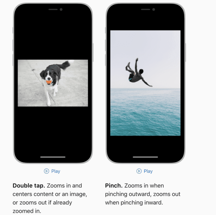
You also should make sure that your in-app gestures don’t interfere with system-wide iOS settings. For example, certain gestures will automatically bring the user back to the home screen. Swiping down from the top of the screen reveals the control center.
If your app does something different, it will add confusion and frustration to your users.
Don’t: Design Your Light and Dark Appearance Settings
Do not create separate designs for light and dark appearances. Dark themes are a growing trend in web design, but you shouldn’t apply this concept to your iOS app design.
That’s because Apple already has built-in system settings that allow users to adjust the appearance of their devices. Your light and dark designs could clash with the existing theme settings on a user’s phone or tablet, ultimately hindering the user experience.
This is also a significant concern for people who have certain settings applied for accessibility reasons. So it’s best to avoid light and dark settings altogether. Let users apply those themes on their own devices, and don’t worry about it on your end.
Do: Design an Adaptable User Interface
One major point of emphasis for interface design is adaptability. You can’t design the UI elements with just one device in mind. Your interface design must work seamlessly across all iOS devices.
This includes all iPhone models and tablets running on different iOS versions.
The user interface should change automatically when the app is being run on a different device. For example, split views for multitasking on an iPad should be taken into consideration. How will the typography or UI kit change when an iPhone user rotates the screen?
If you’re not designing for adaptability, there are going to be flaws in your app design and its usability.
Best iOS App Design Inspirations
If you still need help coming up with a design concept, the examples below will help steer you in the right direction. You can find iOS design inspiration for apps across a wide range of categories while following the latest UI/UX design trends.
Templates and existing apps are always an excellent source of guidance when you’re designing a mobile application.
Banking App
Here’s an example of a banking app design from Ishtiaq Khan Parag for unflip on Dribbble.
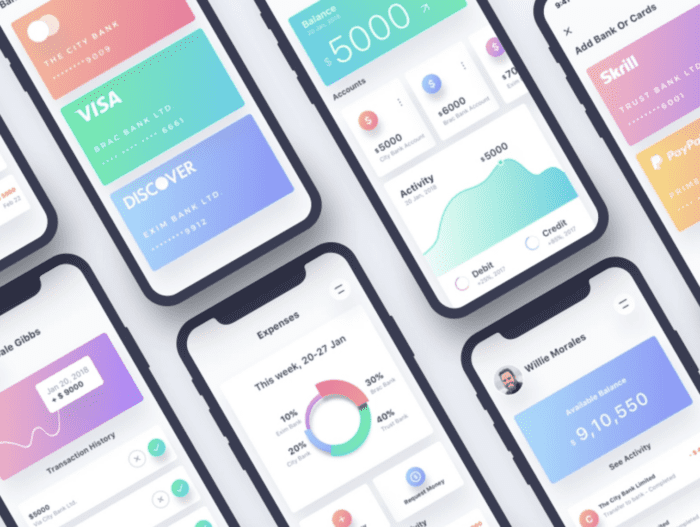
As you can see, it’s somewhat unique compared to traditional financial apps. The color palette is soft and friendly, which is something that users really appreciate in an iOS app.
If you look closely, you can see the design is also built for functionality. For example, if a user wants to click or access a credit card through the app, it’s easy to distinguish one card from another because of the color differences, space, and size.
Social Media App
The iPhone X Social App by Shakuro on Dribbble is a modern iOS app concept for social media.
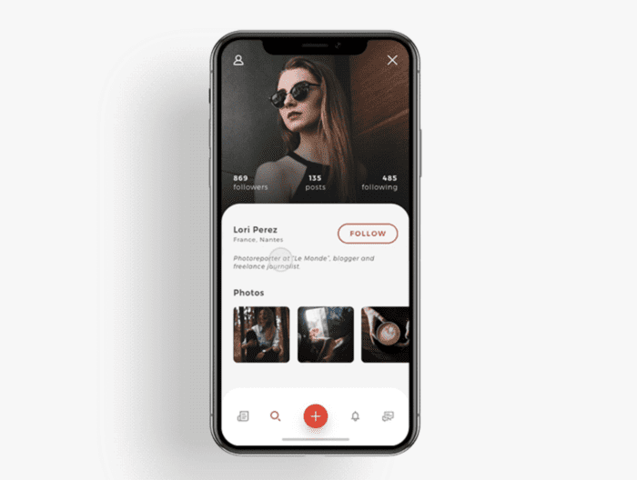
The design prioritizes a smooth user interaction when navigating through profiles. There’s a clear visual hierarchy for images, and the layout is easy to follow.
You can clearly see the ability to search or quickly navigate to parts of the app. Overall, it’s really clean and works perfectly for iPhones. The imagery style is also visually appealing. From a user perspective, the design looks great but also functions well.
Ecommerce App
Here’s an e-commerce app design from BuildFire.
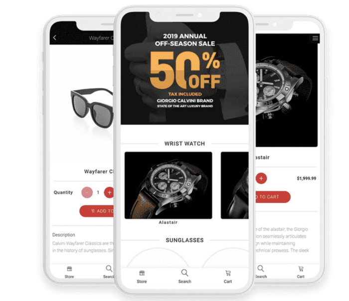
This design uses white space to focus on what matters most for the app’s purpose—the products. In each screenshot, the products clearly jump out at you.
The lack of clutter on each page makes it easy for users to browse through products and add items to the cart. Since the screens aren’t filled with extra information, the CTAs like “add to cart” are a clear point of emphasis.
Having a menu at the bottom of the screen also makes it easy for users to navigate to the app’s most important pages.
Smart Home iOS App
The Smart Home Control App Concept by Kristina Malik for Steelkiwi Inc. on Dribbble is a great example that showcases a great design without sacrificing functionality.
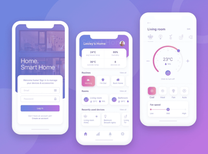
This smart home app concept has a minimalist aesthetic but still has a highly functional dashboard.
It’s easy for the user to navigate across screens, and they can get a ton of information at-a-glance from a single view. The color palette is unique and on-brand with the feel for this concept.
All of this translates to a positive user experience as they’re trying to control so many different aspects of smart technology throughout a home.
Music App
When looking for music app inspiration, it’s tough to look past an industry leader like Spotify.
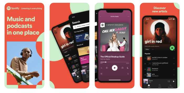
Beyond brand recognition, Spotify has a great app in terms of its functionality. Obviously, the primary function is a music player. But Spotify also makes it easy for users to find podcasts and customize their listening needs.
There’s a seamless ease of use throughout the app interface, and users can get different features and benefits based on the subscription pricing they select.
If you want to create a podcast or audio content app, following the lead of Spotify or Apple Music is always a good idea.
Event Planner App
Here’s another event app concept from BuildFire.
You have a lot of flexibility with the mobile app design choices for events. It all depends on what type of event you’re planning.
For example, a concert app (like the design above) would be very different from a wedding planning app or a networking app for business conferences. The color palette must match the theme and feel of the event.
At the same time, functionality is always a top priority for iOS app design. Users should be able to clearly find event info, register, connect with other attendees, and perform other key tasks. Having a dedicated section of the app designed for sponsors and exhibitors should be taken into consideration as well.
So make sure you think about the CTA placement and colors when you’re going through the wireframe process for your event app.
Meditation App
Headspace is one of the most popular apps for meditation and sleep.
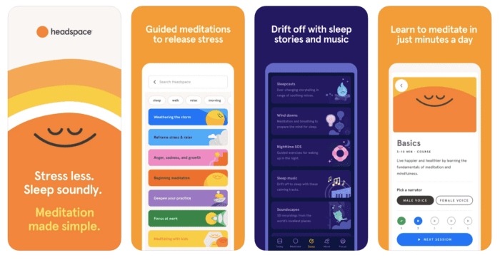
This is an excellent design concept to model after if you’re trying to create an app that offers similar functionality. The color palette is bright and friendly, which helps put users in the mood for meditation.
It’s easy for people to navigate between screens to find the perfect type of meditation for unique scenarios. They can choose from stress meditations or anxiety-reducing tips. All of the options are quick to find and access because of the app’s functional design.
Conclusion
UI/UX design is important when you’re creating an iOS app. Make sure you start with the right color palette, use finger-sized gestures, create a wireframe, add extra views, and consider iOS gesture norms in your design concept.
Following the latest design trends will keep your users happy and ensure the app’s usability isn’t compromised. You can get iOS app design inspiration from platforms like Dribbble, Behance, and Pinterest. Using a template is another useful starting point for inspiration.
If you need some assistance with your iOS app design, request a free consultation with the experts at BuildFire. With BuildFire Plus, we’ll handle all of the app design steps for you. Then we’ll take that design and create a stunning app. Check out our app showcase page and customer stories for even more app design inspiration.
Frequently Asked Questions
How can I ensure my iOS app design stands out in the App Store?
To make your iOS app design stand out, focus on a unique and consistent color palette, intuitive navigation, and user-friendly interfaces.
Why is wireframing important in iOS app design?
Wireframing is crucial as it helps visualize the app’s layout and user flow before development.
How do I incorporate iOS gesture norms into my app design?
Familiarize yourself with standard iOS gestures, such as single taps for actions and swipes for navigation, to meet user expectations and enhance usability.
Should I design separate light and dark themes for my iOS app?
No, it’s best to avoid designing separate themes as iOS devices have built-in settings for light and dark modes, ensuring compatibility with user preferences.