The Essential Principles of Mobile Web Design
When mobile-mageddon arrived last April, lots of businesses realized that building a mobile website wasn’t just a thing they’d have to tackle eventually, but an absolute must-have right now if they hoped to stay relevant and compete. That Google decided that mobile friendliness is going to influence search rankings is just icing on the mobile website cake.
But even though mobile search has overtaken its desktop cousin, the way people search on mobile—and the way they interact with mobile websites once they’ve landed on them—is different than the way they behave on desktop. And too few mobile website designers are paying attention.
Engagement, for one thing, is entirely different between mobile and desktop users. Take a look at Google’s numbers:

Image via Clickz.com
While there’s near parity in terms of number of searches, desktop users spent over three times longer on site and visited three times as many pages on each site. And the bounce rate for mobile was nearly twice that of desktop.
Key Takeaways
- Mobile Search Dominance: Mobile search has surpassed desktop, changing user interaction dynamics.
- User Engagement Differences: Desktop users engage longer and visit more pages compared to mobile users.
- High Mobile Bounce Rates: Mobile bounce rates are nearly double those of desktop, indicating a need for optimized design.
- Mobile-First Design: Designing for mobile requires leveraging unique mobile behaviors and device capabilities.
- Performance Priority: Fast load times are crucial to retain mobile visitors and reduce bounce rates.
You can make of that what you will, but here are some hypotheses:
➤Mobile users have a pretty clear idea of what they are looking for when they search—they are on a mission for specific information.
➤If they don’t find what they’re looking for right away on a site, they will look somewhere else.
➤They don’t have the patience to dig deep through a complicated navigation architecture; they expect to find what they’re looking for with just a few clicks.
So…what does that mean for your mobile website design? Quite a lot, actually. Too many designers approach their mobile website as just a scaled down version of their main site, which misses the point, in my opinion. Your mobile website should be an opportunity to really leverage the unique qualities of mobile devices and engage the unique behaviors of mobile users.
Your mobile website should do more than just replicate the information on your desktop, it should deliver the information a mobile customer is looking for in a way that’s optimized for a mobile device. And that means a mobile-first mentality and design principles.
1. Prioritize Performance.
Slow load speed is the biggest frustration factor for mobile web users and one of the main reasons a customer will bounce away from a site; in fact, over three-fourths of consumers will click away from a site that loads slowly or won’t display properly on their mobile device. So you need to worry about performance first or your customers won’t stay on your site long enough to see all your other fancy mobile-first elements. Here are some things to keep in mind while you’re planning your mobile pages:
?Keep pages to 1 MB or smaller for fastest load times.
?Think carefully about the images you need, and crop, resize, and compress them for faster loading.
?”Minify” your code, especially JavaScript; JS requests increase complexity and slow page rendering.
If you want to know how your mobile site is performing, use this Google PageSpeed analyzer for concrete steps you can take if your site is loading to slowly on mobile devices.
2. Rethink Your Homepage Content.
For most small businesses, what mobile website visitors want to accomplish is probably different from what visitors to their main website want to do. All those flashy branding elements and images on your main site homepage aren’t going to interest your mobile visitors. Therefore, the information you put on your homepage should be directed at the needs of your mobile users, most likely some combination of the following:
?contact info, with click to call or click to text
?location/directions/hours of operation
?search bar/product search
?place an order/order status/order tracking
?make a reservation/appointment/service request
?customer login/account access
?option to view main website
?mobile app download
?social media buttons
3. Simplify Menus and Navigation.
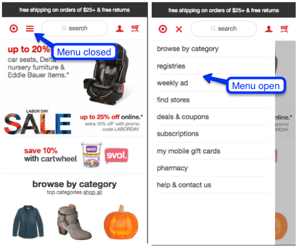
The “hamburger” menu is universally recognized and a very mobile-friendly solution to navigation—and it also respects the generally accepted idea that mobile navigation should take, at most, three taps to arrive at the desired page. Ideally, you should have just one sub menu under each menu category for ease of use. Be sure to put your most important pages first.
If you don’t need more than three or four menu items, you can experiment with static navigation, which has a simplicity that is visually appealing.

The key consideration in both cases is making your navigation and menu options easy for fingers of any size to tap and touch. Too many options packed in too tightly makes fingertip navigation virtually impossible. Which brings us, logically, to…
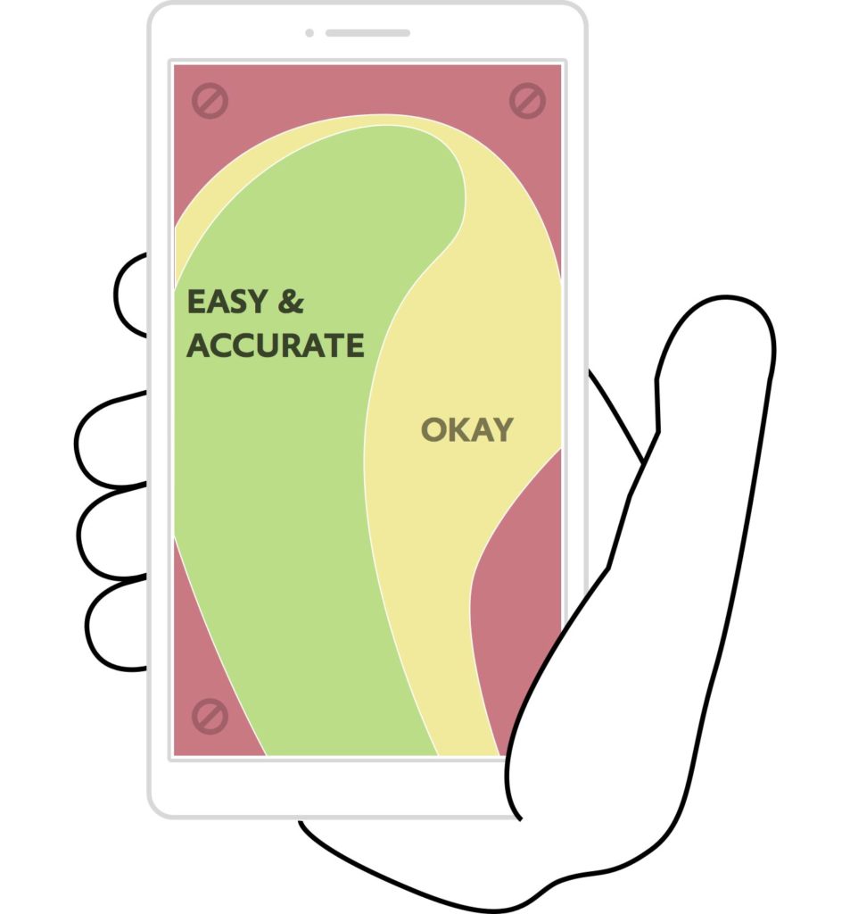
4. Design for Touch.
This is actually more nuanced than doing the obvious: Making sure buttons are large enough and spaced far enough apart that anyone, even someone with fat fingers, can navigate with ease. The average finger needs at least 44 pixels in both dimensions for a good touch experience; anything smaller and user experience suffers.
But beyond that, you need to design your mobile website around the common gestures and motions mobile device users naturally use—and using those gestures as much as possible to let users accomplish their objectives on your site. What does that look like?
- Letting users tap a button or icon to call you, text you, email you, add an event to their calendar, use GPS to get directions, download a podcast—integrating the mobile device’s native functions and apps.
- Respecting the thumb zone in menus, navigation, and functionality.
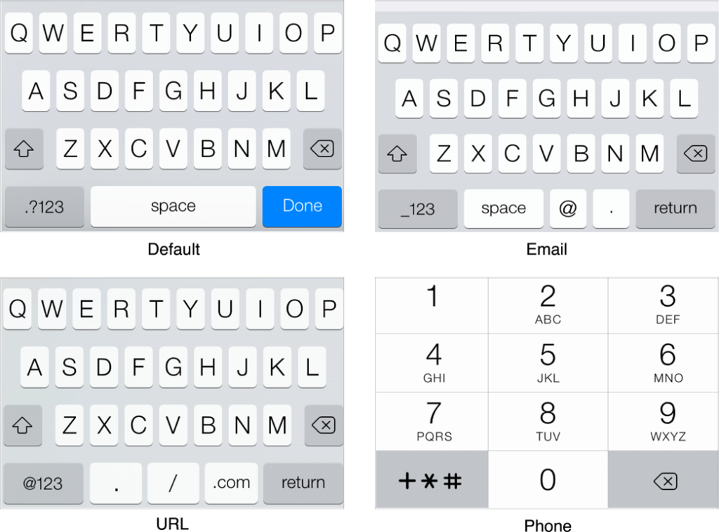
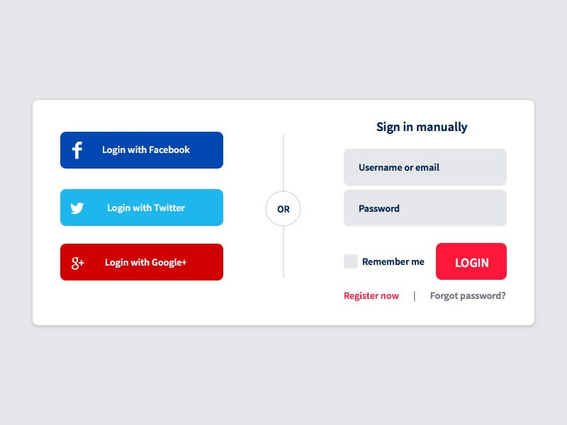
- Making user input as simple as possible: Choosing the right keyboards, using visual calendars instead of typing dates, incorporating auto defaults and auto complete, using social logins.
Frequently Asked Questions
How can I improve mobile website performance?
Improving mobile website performance involves optimizing load times by keeping pages under 1 MB, compressing images, and minifying code. Platforms like Buildfire make this straightforward by offering tools to streamline these processes.
What are the key elements of a mobile-friendly homepage?
A mobile-friendly homepage should include essential elements like contact info, location details, and a search bar. Buildfire, for instance, offers templates that prioritize these elements for mobile users.
Why is navigation simplification important in mobile design?
Simplified navigation is crucial because mobile users expect to find information quickly. Tools like Buildfire allow businesses to create intuitive navigation structures that enhance user experience.
How do I design for touch on mobile websites?
Designing for touch involves ensuring buttons are large enough and spaced adequately for easy navigation. This enhances user experience by accommodating natural mobile gestures.
What role does user engagement play in mobile web design?
User engagement is vital as it differs significantly from desktop interaction. Mobile design should focus on quick access to information to reduce bounce rates and improve satisfaction.
5. Reform Your Forms.
For the most part, mobile users really, really hate to type on their devices, so expecting them to enter a lot of information on your website is a real turn-off that is likely to cause a lot of visitors to head for the exits. So what can you do?
➤Only collect the minimum amount of informatio
A mobile visitor spends just four minutes and checks out about eight pages on average, which means he is spending about half a minute per page. That is a shopper on a mission; the desktop visitor spends twice as long on site per page.
| Visitor Type | Average Time Spent | Average Pages Viewed | Time Spent Per Page |
|---|---|---|---|
| Mobile Visitor | 4 minutes | 8 pages | 0.5 minutes |
| Desktop Visitor | 8 minutes | Varies | 1 minute |
For the mobile website designer, then, the challenge is making sure the menus and navigation makes it easy to find a specific product or narrow down the choices to meet a shopper’s particular needs that day. A mobile device user is most likely not going to spend a lot of time scrolling endlessly through products, so you have to be creative in providing menu options to help him find what he wants quickly.
Frequently Asked Questions
What is the average time spent by mobile visitors on a website?
Mobile visitors spend an average of 4 minutes on a website.
How many pages do mobile visitors view on average?
Mobile visitors view about 8 pages on average.
Why is it important to minimize typing for mobile users?
Mobile users dislike typing on their devices, and excessive typing can lead to user frustration and increased bounce rates.
How can mobile website designers improve user experience?
Designers can improve user experience by simplifying navigation and providing quick access to desired products or information.
What is the difference in time spent per page between mobile and desktop visitors?
Mobile visitors spend about 0.5 minutes per page, while desktop visitors spend about 1 minute per page.